Web Design Trends: Flat Colour
I've noticed a new trend (aesthetic, style, paradigm) in web design which I think is rather nice. There was a time when websites were fairly text heavy and animated gifs were the pinnacle of cutting edge design and showed real prowess in design skills. Things moved on quickly and it was all about nice layouts and 3D bevelled buttons. Some time afterwards Apple and others started a trend towards very slick "glassy" looking interfaces. More recently the web 2.0 aesthetic has been all about large text, making things big and tasteful gradients.
Well, it seems that a new web design trend is emerging, I first saw it on the latest release of Skype and have since spotted it cropping up in other new releases. It's all about very minimal, tasteful use of flat colour (as opposed to gradients), uncomplicated lines, square corners (as opposed to rounded) and relatively small sizes to make the most of the pixels available.
Here are some examples of the big players using the glassy/web 2.0 aesthetic:
Apple
A combination of very glassy buttons, subtle gradients and clean, minimal layouts.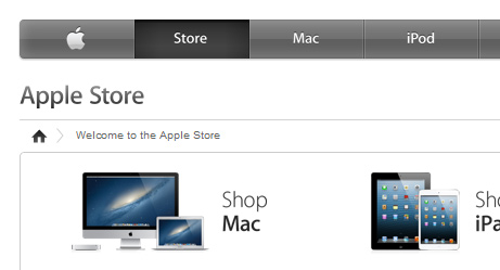
Amazon
Drop shadows, rounded corners and very subtle gradients. A mix of web 1.0 and web 2.0. Using the space effectively clearly a priority as they've always had a full-screen layout.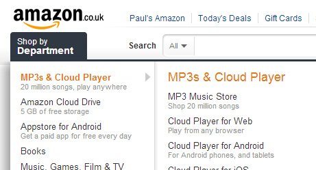
Play.com
Not-so-subtle gradients and big glassy buttons.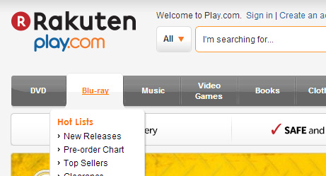
And here are some examples of this new "minimalist" aesthetic:
Skype
Their website shows this new trend but it's even more apparent in the latest redesign of their desktop client. Flat colours, square corners and a very clean minimalist feel. I like it.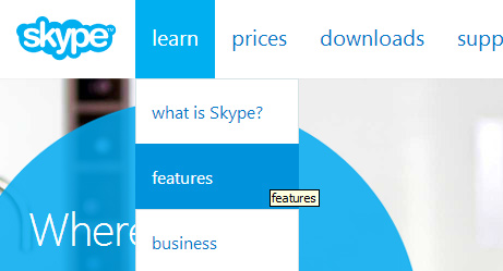
Windows 8
Big areas of flat colour (if a little garish) and a simple layout.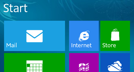
facebook
Already quite close to this new trend in design. All they need to do is lose the very slight bevels, rounded corners and subtle drop shadows and they're there.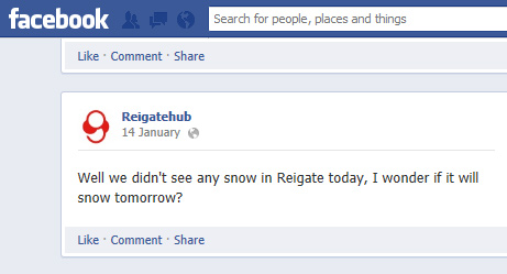
ebay
A clean and minimal new logo, and the square corners on the navigation along with thin lines and no drop shadows fit the new trend. The one gradient there is serves a purpose to tie in the baloons.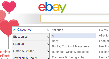
What do you think about this new web aesthetic? Love it, hate it or not yet decided, comment below!
blog comments powered by DisqusTestimonials


