
Blog
The Antropy OpenCart Blog
Dark Mode in eCommerce: When to Use It and Why It Works
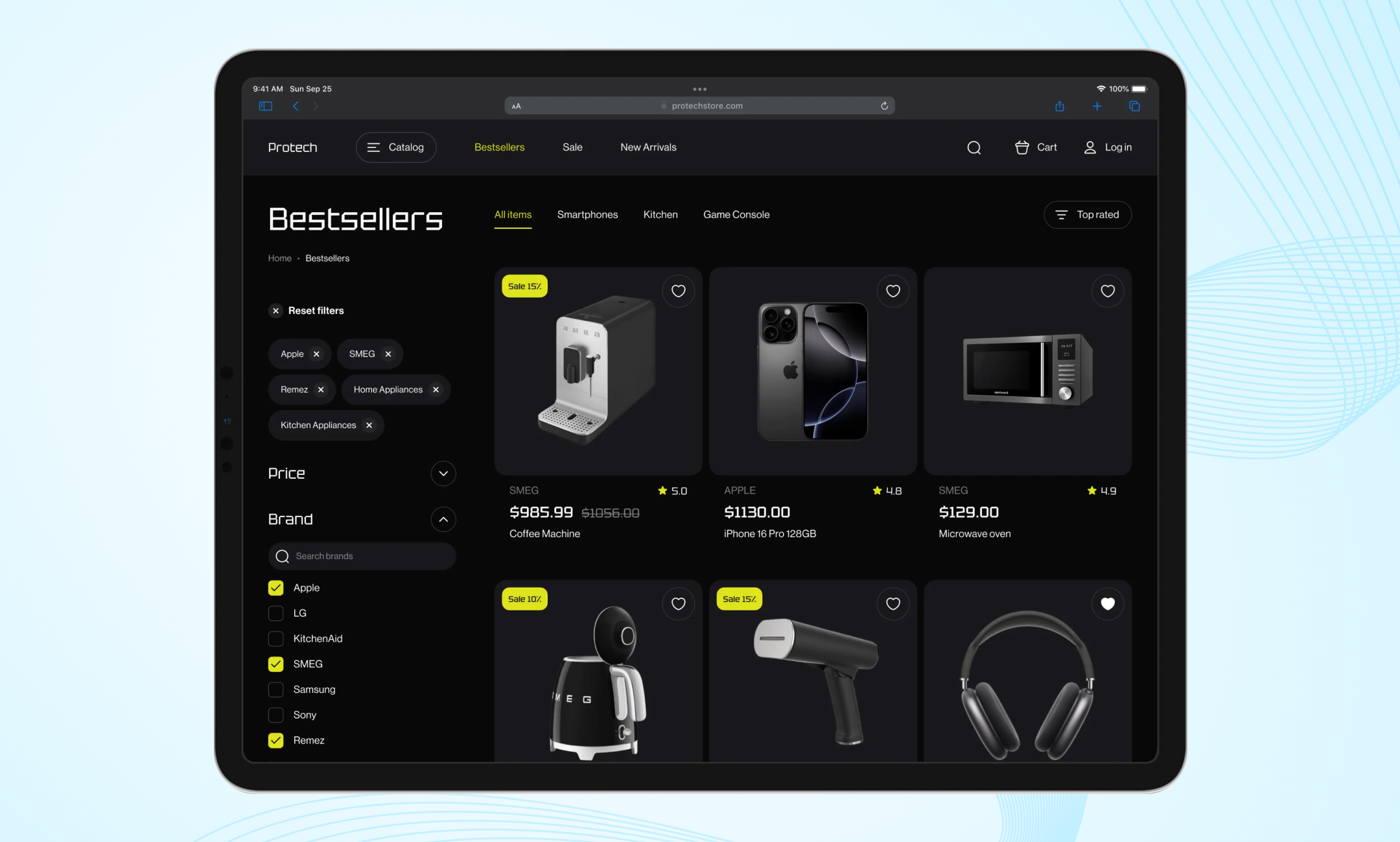
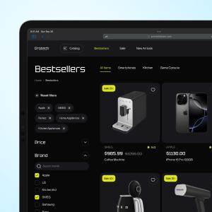
Image copyright dribbble.com
In recent years, dark mode has become more than just a design trend—it’s a powerful UX strategy. Brands across fashion, tech, luxury, and gaming are adopting it for its visual appeal, user comfort, and ability to elevate aesthetics. But dark mode isn’t always the right fit. In this article, we’ll explore when it makes sense to use dark mode in an eCommerce setting, why it works, and how to implement it effectively.
Why Dark Mode Works
1. Better Visual Comfort & Reduced Eye Strain
Many users browse sites late at night or in dimly lit environments. Dark mode reduces glare and lessens blue-light exposure, making it easier on the eyes. Designs that use dark backgrounds and light text help reduce fatigue.
2. Enhanced Product Imaging & Visual Hierarchy
Dark backgrounds help images, product photography, and vibrant colors “pop.” Items with bright or saturated colors stand out more against dark or charcoal backgrounds. This is especially useful for industries like tech, accessories, or luxury products.
3. Energy Savings on OLED/AMOLED Devices
On devices using OLED or AMOLED screens, dark pixels consume less power. That means websites with dark mode can be lighter on battery usage, helping users with mobile browsing.
4. Modern, Premium Brand Perception
Dark mode often signals sophistication, luxury, and modernity. Brands using dark themes are perceived as cutting-edge and premium. For many high-end tech, fashion, or innovation-driven brands, dark mode aligns well with the desired brand identity.
5. Better Focus & Engagement
By minimizing distractions (e.g., no harsh whites), dark mode can help users concentrate on key content—product details, CTAs (Call to Actions), media like video or image galleries. Comfortable visuals tend to keep users browsing longer.

Image copyright dribbble.com
When It’s Best to Use Dark Mode
Here are the cases where you’ll likely see real benefit from implementing dark mode:
- Luxury, Tech, & Gadget Stores: Products with sleek finishes, glowing lights, modern or high-tech appeal tend to look excellent against dark backgrounds.
- Fashion & Accessories Brands: Especially when product colors are bold and need to be highlighted.
- Mobile-First or Mobile-Heavy Traffic Sites: If many of your users shop via phone in low-light conditions, dark mode improves comfort.
- Evening or Nighttime Shopping Contexts: When many users browse at night or in dim ambient light, dark mode helps retention.
- Branding That Matches Elegance or Exclusivity: If your brand wants to communicate premium, mystery, or high-quality, dark design helps reinforce that perception.
When to Be Careful
Dark mode isn’t always the right choice. Some pitfalls include:
- Text Legibility Issues: If contrast isn’t done right, text on dark backgrounds can hurt readability. Light text on pitch black (#000) may lead to glare; better to use dark greys.
- Heavy Text / Long Content Pages: Blogs, help sections, long product descriptions may read better with light background.
- Inconsistent Imagery and Branding: Product photos or logos designed for a light background may look odd on dark. You may need alternate image versions.
- Brand Identity Mismatch: If your brand colors are very bright or pastel, or if your identity is playful or family-friendly, dark tones could feel off.
Best Practices for Implementing Dark Mode
To make a successful dark mode design you should consider several issues:
- Text & Contrast: Use WCAG guidelines. Make sure headings, body text, buttons have high enough contrast. Off-white or light gray text often works better than pure white.
- Toggle / Theme Switcher: Let users choose light or dark mode. Store that choice so returning visitors see the same.
- Optimize Images: Use images with transparent backgrounds if needed, avoid washed-out product photos. Some images may need variations for dark mode.
- Test Across Devices and Lighting Conditions: Test in daylight, evening, low-light, on desktop, mobile, under OLED vs. LCD screens.
- Accent Colors & CTAs: Use bright accent colors for buttons and highlights so they pop — e.g. vibrant greens, blues, or neons.
- Avoid Extreme Blacks: Deep dark grays are often better, reducing harshness and helping with readability.
Dark mode isn’t a passing fad—it’s a design choice that can improve usability, brand perception, visual impact, and even energy consumption. When done right, it can set your OpenCart store apart especially in niches like tech, luxury, and fashion. But it’s not one-size-fits-all: let your brand, product imagery, and audience guide the decision.
If you’re considering adding dark mode to your store, we’d be happy to help you plan how it works visually, how it switches, and how to test it to get maximum benefit.