
Blog
The Antropy OpenCart Blog
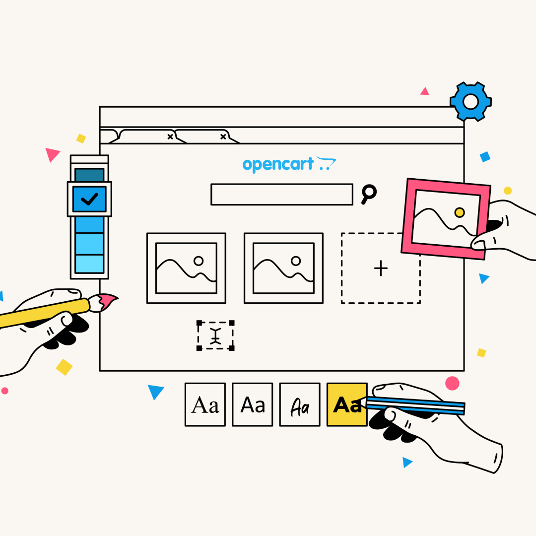
How to Make Your OpenCart Store Feel More Premium Without a Full Redesign
In the world of eCommerce, first impressions are everything. You only have a few seconds to convince a visitor that your brand is trustworthy, professional, and worth their hard-earned money.
However, many OpenCart merchants feel stuck. They know their site looks a bit dated or cluttered, but they aren't ready to commit to the five-figure investment and months of development time required for a ground-up redesign.
The good news? You don’t need to tear everything down to level up. By focusing on high-impact visual and functional quick wins, you can transform a standard store into a premium shopping experience.
Here is how to make your OpenCart store feel more high-end without a full redesign.
1. Audit Your Typography and Spacing
Nothing screams budget website like cramped text and inconsistent fonts. Premium brands use whitespace (the empty space around elements) to let their products breathe.
The Fix: Increase the line height of your body text and add more padding between sections on your homepage.
Pro Tip: Stick to two font families maximum: one for headings and one for body text. If you’re still using the default OpenCart fonts, switching to a clean, modern Google Font like Inter, Montserrat, or Playfair Display can instantly modernise the feel.
2. High-Quality, Consistent Imagery
You can have the best website code in the world, but if your product photos are blurry or have different coloured backgrounds, the site will feel cheap.
The Fix: Ensure all product hero images use the same background (pure white or a consistent light grey).
The Premium Touch: Use lifestyle imagery on your banners. Instead of just showing a product, show the product in use in an aspirational setting. This sells a lifestyle, not just an item.
3. Declutter the Header and Navigation
Standard OpenCart installations often suffer from menu bloat. If your header is packed with too many links, currencies, and languages that you don't actually use, it creates cognitive load for the customer.
The Fix: Move "Information" links (About Us, Delivery, Terms) to the footer. Keep your main navigation strictly for product categories.
The Premium Touch: Implement a Sticky Header so that as users scroll, the logo and cart remain accessible. It’s a small detail that makes the site feel much more app-like and polished.
4. Polish the Micro-Interactions
Premium stores feel smooth. This usually comes down to CSS transitions: the way a button changes colour when you hover over it, or how a mobile menu slides out.
The Fix: Add subtle hover effects to your Add to Cart buttons and product images. A simple 0.3-second fade or a slight zoom on an image makes the site feel responsive and high-quality.
5. Optimise for Mobile-First, Not Just Mobile-Friendly
Most of your UK customers are likely browsing on iPhones or Android devices. A site that is responsive but awkward to use with a thumb doesn't feel premium.
The Fix: Check your button sizes, are they easy to tap? Is your checkout process seamless on a small screen? Removing unnecessary fields from the checkout can significantly increase your conversion rate and brand perception.
Give Your Store a Professional Edge
Making these changes requires a keen eye for design and a deep understanding of OpenCart’s underlying code. If you’re happy with your current platform but feel your store's appearance is holding you back, you don’t need a total overhaul.
At Antropy, we offer a specialised Design Refresh service. We take your existing OpenCart store and apply professional design principles, UI/UX improvements, and performance tweaks to give you that "big brand" feel at a fraction of the cost of a full redesign.
Ready to elevate your brand? Explore our OpenCart Design Refresh Service here and let’s make your store stand out from the competition.