Ecommerce Inspiration: Examples Of Successful Businesses Using OpenCart
In any industry you care to mention, learning from those who’ve already achieved what you’re trying to do is one of the best ways to improve. By seeing how they go about their business — what they do and don’t do — you can figure out how you’re going to reach your own goals.
This is particularly the case for ecommerce, because so much money, time and effort has gone into cracking the formula of selling online that it would be foolish to attempt to start from scratch. The best approach is to take inspiration from as many sites as you can, but to pay particular attention to the brands in your niche and the sites that use the platform you’re planning to use.
So if you’re planning to use OpenCart for your ecommerce store, why not take a look at some thriving businesses running OpenCart? Let’s do just that by checking out four such sites.
RC Geeks
RC Geeks is a site aimed at — yes, you guessed it — geeks, with a product line-up of compact gadgetry, and the site is very tastefully done. Note the use of bold colours and strong contrasts: the logo is clear and crisp against a dark background, the key selling points (most notably the Trustpilot rating, since reviews are hugely important) are given a fresh grey backdrop to make them clearer, and the key links are highlighted in distinct ways.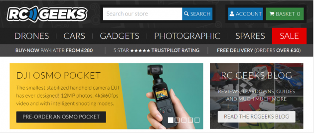
The navigation options are strong and clear without standing out too much, and the vital parts (the basket and the sale) are given bold colours that don’t appear elsewhere on the screen. Throughout the page, the content is modular and extremely easy to read. Furthermore, the mobile version looks excellent — the bulky header vanishes, leaving behind a light and compact theme that’s perfect for a small screen.
6DollarShirts
6DollarShirts has an even clearer name than RC Geeks, because that’s exactly what it does: it sells shirts that start at $6. It doesn’t only sell them, of course, but it’s important to have a catchy name — and the site design builds on it superbly with a tremendous minimalist layout.
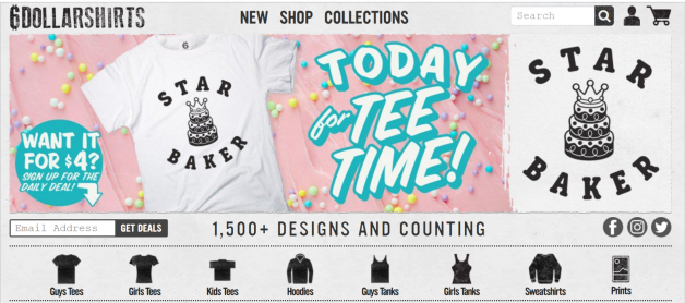
Once again, think about the excellent use of colour. Instead of using it everywhere and reducing its impact, the designer opted to use blacks and greys for mostly everything — leaving the whites and pastel colours to stick out immediately. Everything is nicely tiled, and categories are set out sensibly, ensuring that it’s easy for the shopper to find what they’re looking for.
Off the Mark
Off the Mark (as you can see from the screenshot below) is a daily newspaper cartoon, and the creator built this store to sell the individual comic panels for use in digital or printed media. Sometimes it’s enough to get by using free stock images, and sometimes you need something more specific or creative, and that’s where this site comes in.
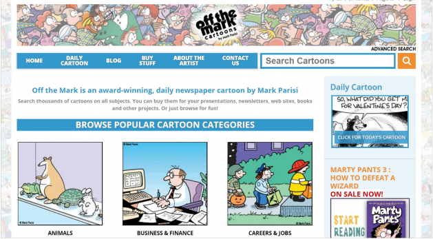
What do I like so much about this site? Well, it fully embraces the cartoon aesthetic in every facet. In stark contrast with 6DollarShirts, it’s all about colour, from the content to the navigation. It’s exactly as complex as it needs to be, and it places all the emphasis on the most important things: the cartoons (notice how the cartoons have the strongest colours on the page?).
WoodenPosters
WoodenPosters is the clearest name of the bunch, because it sells wooden posters. That’s it — the whole inventory. Nothing but posters made from wood. And the top of the website homepage really commits to showcasing the type of home that might feature such things: rustic, rugged, crafty, and decidedly warm.
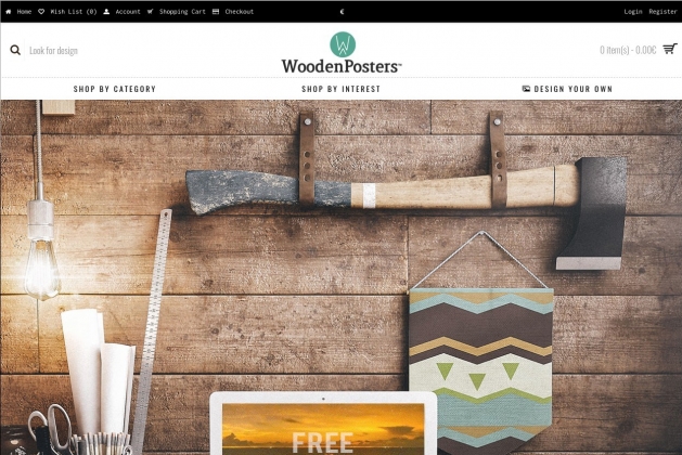
Something I really like about this site is the use of animation. The background on the laptop screen moves, and there are animated GIFs scattered throughout the site, but they’re all fairly grainy and retro. It really touches upon the retro concept of selling vintage designs in a classic format through a modern website. Yet again, colour is key, and green of the logo pops up in various places to ensure that certain elements stand out.
Each of these OpenCart sites does an excellent job of adhering to best ecommerce practices while showing off a unique brand style. That’s the type of balance to aim for — cover all the practical elements to make your site as easy to use as possible, then add on some personal flair to give people a reason to engage with your business.

