Why You Need to Aim for a "Frictionless" Checkout
If humans were purely logical creatures, buying decisions would be cold and calculated. Before buying a product a customer would assess their needs, determine what product would fulfil those needs for the lowest cost and proceed to purchase it from the cheapest supplier. Ecommerce websites would simply need to list products, features, prices and perhaps an exploded diagram of the product to avoid any ambiguity. The world would also be a rather dull place. Fortunately though, most of us make buying decisions based more on on emotion than logic. Nothing makes this clearer than A/B testing where tiny "irrelevant" changes to an ecommerce website such as the colour of a buy button can have a tangible and measurable impact on sales.
In traditional retail, it's long been known that the shopping environment can have a massive effect on sales. In fact it's intuitively obvious that if when walking in to a shop a customer smells the delicious aroma of freshly baked bread or freshly brewed coffee, they're more likely to buy a loaf or get a cup. Less obvious but still influencing factors are the temperature in the shop, the background music (if any), they lighting, the layout ... everything down to the uniforms the staff are wearing and the expressions on their faces.

It's about giving the right impression, making sure that the products on offer are perceived to have at least as much value as the price indicated on the tag and preferably far more, and it's about keeping the customer in a buying mood.
Ecommerce is where the traditional principles of retail mix with those of user interface.
Don't Irritate the Customer
Now of course this seems obvious, but not so obvious are the types of things on an ecommerce site that will annoy a user. Anything that causes friction is something that slows them down, even by a matter of milliseconds. Here are a few of the types of things that will reduce your sales:
- Complexity
 Einstein said "Everything should be made as simple as possible, but never simpler." The reality is that almost everything is more complex than it needs to be. Apple's success is almost entirely due to its incredible ability to make a complex device such as the supercomputer you have in your pocket in to a device a small child (or even a cat or frog) can easily use.
The truth is that there are often so many extraneous and irrelevant parts to an ecommerce site that customers are slowed down in their tracks, overwhelmed with options and complexity. Some are even like an online test - click here, now here, then select this and do this, then go here ... etc. etc.
Why not remove anything and everything that doesn't aid the buying process? Like the notes and musical symbols in sheet music, the lines of code in a software program or the nuts and bolts in a piece of Ikea flat pack furniture, if it's not being used it shouldn't be there. Any element on the page is either increasing sales or reducing them. - Slowness of Any Sort
Amazon have done the research to show that for each extra second of page load time, they lose £x million in sales. The same goes for every aspect of an ecommerce site. "Did I click that link?" should be a question that never crosses a customer's mind, the page should have loaded before they've even had a chance to wonder.
Do Arouse the Customer
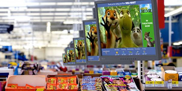
Obviously this will be easier to do with some products rather than others but don't be too quick to write this off as unapplicable to your product range. We've all been browsing in Debenhams or Robert Dyas when one of those TV screens starts up and makes you jump with a video about an amazing new mop that cleans your floor in half the time with a fraction of the effort. These things work and while I wouldn't always recommend an auto-starting video on your product page, you do need to show your customers how your product will make their life better in the easiest way possible.
In the same way that a warm, nicely lit and attractive bakery with the aroma of fresh cookies wafting out of the door will entice customers in, stunning product photography and a fast, simple easy to use website with as few steps to purchase as possible and fast delivery will keep customers clicking that buy button.
Simple and obvious advice? Yes. Often followed? No.
What are your thoughts? Agree or disagree? Let us know in the comments ...
blog comments powered by Disqus
Testimonials


